 Deutsch
 English


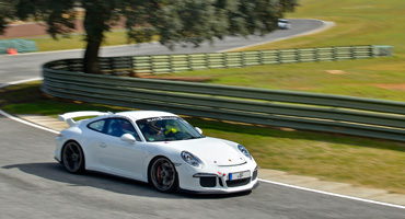
CLUBSPORT
Dein Fahrzeug - von uns betreut.

FIRST STEPS
Dein Einstieg – von uns organisiert.

RACING
Deine Ambition – von uns verwirklicht.

BRANDS
Deine Marke – von uns präsentiert.
Button Designs
- Zugriffe: 1452
Default buttons
Button styles can be applied to anything with the .btn class applied. However, typically you'll want to apply these to only <a> and <button> elements for the best rendering.
| Button | class="" | Description |
|---|---|---|
btn |
Standard gray button with gradient | |
btn btn-primary |
Provides extra visual weight and identifies the primary action in a set of buttons | |
btn btn-info |
Used as an alternative to the default styles | |
btn btn-success |
Indicates a successful or positive action | |
btn btn-warning |
Indicates caution should be taken with this action | |
btn btn-danger |
Indicates a dangerous or potentially negative action | |
btn btn-inverse |
Alternate dark gray button, not tied to a semantic action or use | |
btn btn-link |
Deemphasize a button by making it look like a link while maintaining button behavior |
Cross browser compatibility
IE9 doesn't crop background gradients on rounded corners, so we remove it. Related, IE9 jankifies disabled button elements, rendering text gray with a nasty text-shadow that we cannot fix.
BUTTONS SHORTCODES
[btn size="" type="" class="" class="" disabled="" link="" target="" icon="" icontheme=""][/btn]
type: primary / info / success / warning / danger / inverse / link / flat
size: primary / large / small / mini
disabled: yes / no
icon: add the icon type without the " icon- "
icontheme: white / black
[btn size="" type="" class="" class="" disabled="" link="" target="" icon="" icontheme=""][/btn]
Button sizes
Fancy larger or smaller buttons? Add .btn-large, .btn-small, or .btn-mini for additional sizes.
<p>
  <button class="btn btn-large btn-primary" type="button">Large button</button>
  <button class="btn btn-large" type="button">Large button</button>
</p>
<p>
  <button class="btn btn-primary" type="button">Default button</button>
  <button class="btn" type="button">Default button</button>
</p>
<p>
  <button class="btn btn-small btn-primary" type="button">Small button</button>
  <button class="btn btn-small" type="button">Small button</button>
</p>
<p>
  <button class="btn btn-mini btn-primary" type="button">Mini button</button>
  <button class="btn btn-mini" type="button">Mini button</button>
</p>
Create block level buttons—those that span the full width of a parent— by adding .btn-block.
<button class="btn btn-large btn-block btn-primary" type="button">Block level button</button>
<button class="btn btn-large btn-block" type="button">Block level button</button>
Disabled state
Make buttons look unclickable by fading them back 50%.
Anchor element
Add the .disabled class to <a> buttons.
<a href="#" class="btn btn-large btn-primary disabled">Primary link</a>
<a href="#" class="btn btn-large disabled">Link</a>
Heads up! We use .disabled as a utility class here, similar to the common .active class, so no prefix is required. Also, this class is only for aesthetic; you must use custom JavaScript to disable links here.
Button element
Add the disabled attribute to <button> buttons.
<button type="button" class="btn btn-large btn-primary disabled" disabled="disabled">Primary button</button>
<button type="button" class="btn btn-large" disabled>Button</button>
One class, multiple tags
Use the .btn class on an <a>, <button>, or <input> element.
<a class="btn" href="/">Link</a>
<button class="btn" type="submit">Button</button>
<input class="btn" type="button" value="Input">
<input class="btn" type="submit" value="Submit">
As a best practice, try to match the element for your context to ensure matching cross-browser rendering. If you have an input, use an <input type="submit"> for your button.
SOCIAL ICONS
<ul class="social-icons fixclear">
 <li class="social-twitter"><a href="#">Twitter</a></li>
 <li class="social-dribbble"><a href="#">Dribbble</a></li>
 <li class="social-facebook"><a href="#">Facebook</a></li>
 ...
</ul>
SOCIAL ICONS - Colored
<ul class="social-icons colored fixclear">
 <li class="social-twitter"><a href="#">Twitter</a></li>
 ...
</ul>
SOCIAL ICONS - Colored only on :hover
<ul class="social-icons coloredHov fixclear">
  <li class="social-twitter"><a href="#">Twitter</a></li>
 ...
</ul>
or Shortcode:
type: normal / colored
[socialicons class="" type="" style="" ]
 [socialicon network="" url="#"]
[/socialicons]


